Inspiration

My Bold Hues

I'm so excited for this first ever round-up of my #MyBoldHues favorites!  Several weeks ago, I snuck the announcement into my weekly flip update about our new hashtag!  #MyBoldHues on instagram is a way to show off and celebrate your lives filled with color. For almost a month now, some amazing people have been tagging #MyBoldHues, whether it be spaces, projects or moments that are full of color!  As promised, the last Wednesday of each month (that's today!!!!), myself and the other co-hosts will be sharing our favorite instagrams on our blogs.  I'm overwhelmed by the stellar colorful things you guys have posted on instagram!!
 

It was so tough to pick my favorites to feature!

****As per usual, please practice responsible pinning.  The below images are NOT my own and shouldn't be pinned from my page.  Please click through to the original source to pin inspiration****


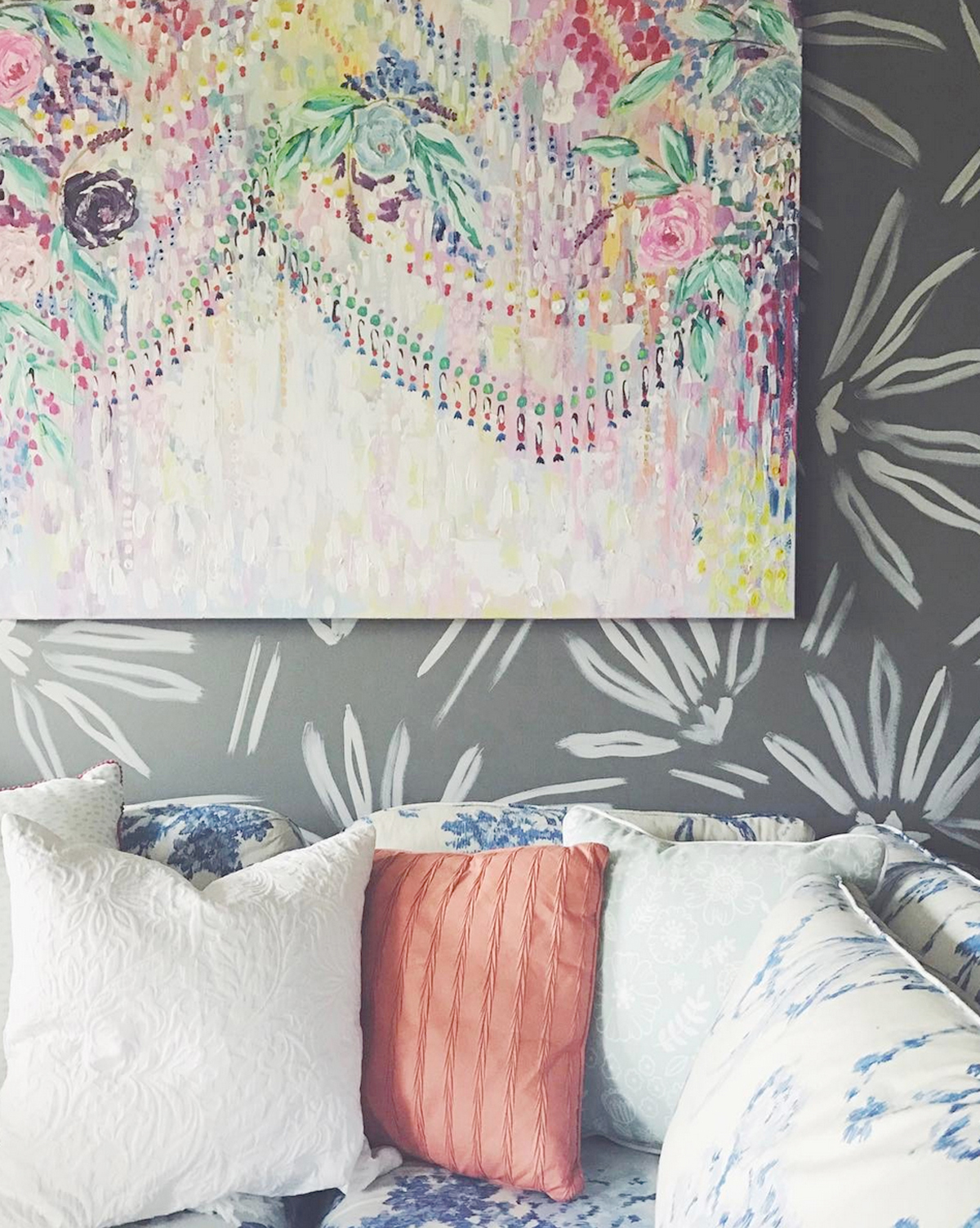
@coppercorners had several swoonworthy #myboldhues posts!  As a painter, I imagine she's always surrounded by color.  This image in particular I absolutely loved the bold mix of floral patterns and textures.  (designers note: the multiple florals work because the scales are so varied!)
 

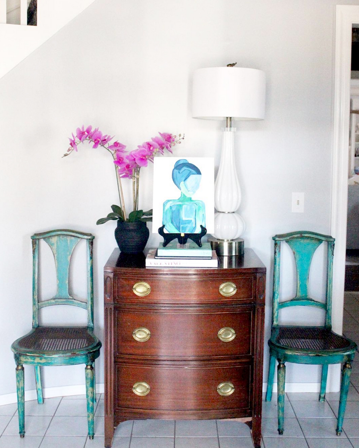
Sometimes it's not about having an explosion of color, but just very well placed touches, just ask @laurenjohnsondesign.  The way the painting and the chairs play so well together is so close to perfection!
 

One of #myBoldHues cohosts, @cate_stylemutthome had me swooning over this little vignette.  Aside from that credenza giving me all the heart eyes, I love how the hanging kilim pieces and plant pot bring in even more fun without going over the top.


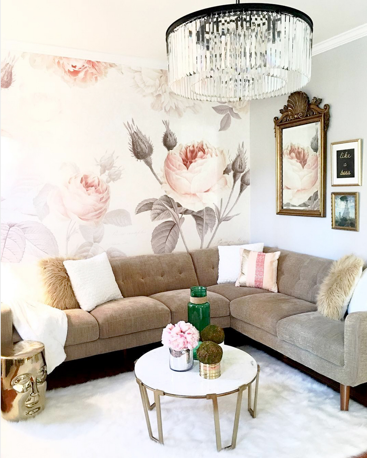
I've accepted that Hubby will never come around to my side on this one, but give me an amazing floral and I'm a happy gal.  @house_of_unicorns used this floral wallpaper so perfectly.  While there are other feminine touches in the space, the classic lines of the mid-century inspired sofa and coffee table give the room an amazing balance.
 

And because for some strange reason, I have nursery's on the brain...

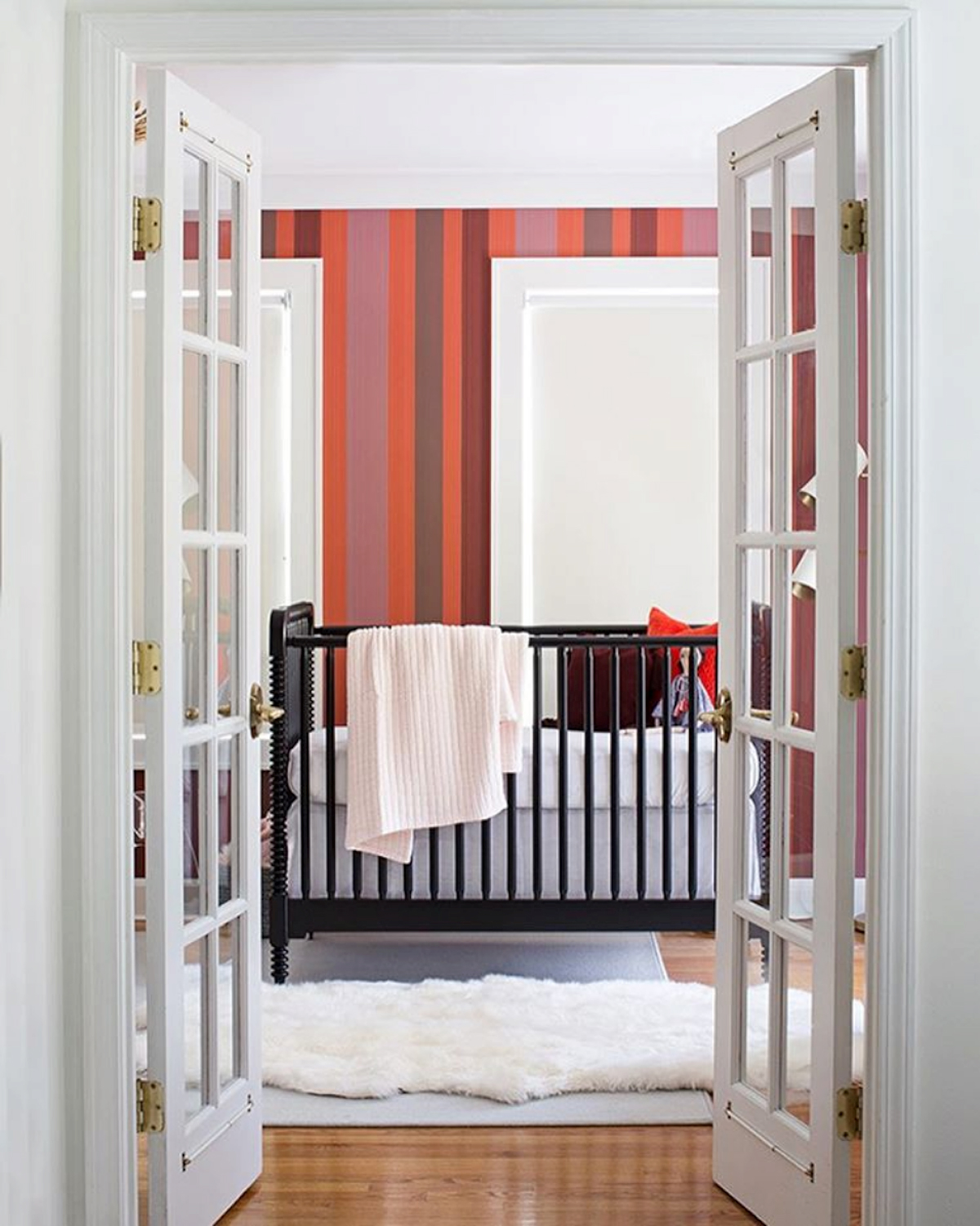
Even in an overall white space, @themakerista added a swoonworthy stripe treatment behind a beautiful but understated crib.  I don't know about you, but I'm very rarely a fan of "cutesy" spaces for babies, so an amazingly stylish space that just happens to be for a baby makes me want to do a happy dance.
 

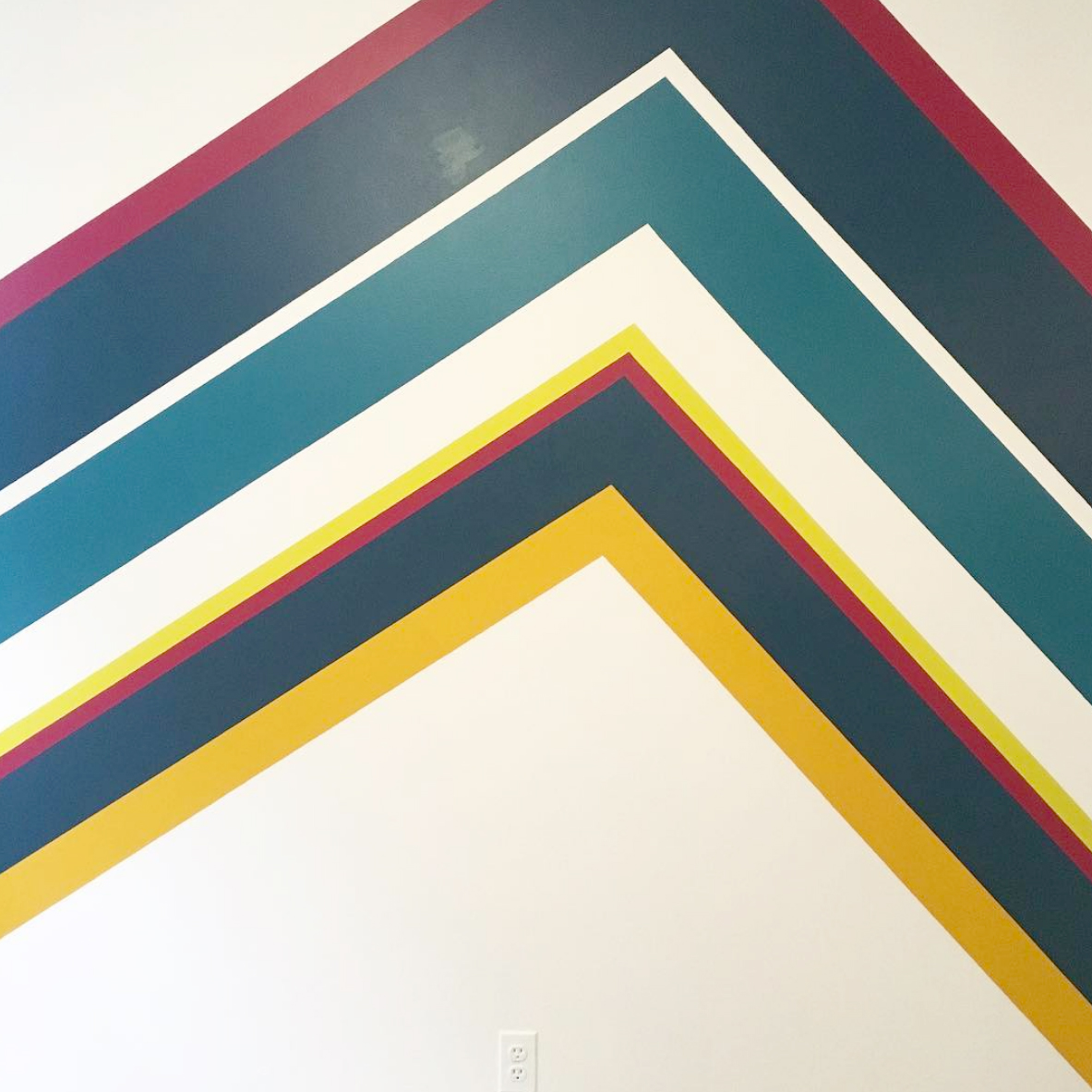
Continuing with my urge to dance, @ariellesgoldman is working on her own nursery and just finished painting this feature for behind the crib.  I can't WAIT to see the rest of the room come together!!  These last 2 images are really getting me revved up to clear my office and start pulling together my little guy's space!


What were your favorite #myboldhues posts this month?  There were so many awesome spaces shared this month I had to follow trend, but I'm hoping in future months we can see more variety too!  Don't forget to tag your items, vignettes, DIYs, and general life moments in addition to your amazing spaces!


Now head over to my awesome #myboldhues cohosts and see what made them weak in the knees:

PMQ for Two

Style Mutt Home

Semigloss Design

Domicile 37

Jest Cafe Blog

Blue i Style

Save

Save

Save

Save

Save

Save

Save

Save

Let's Dance: DanceFIT Design Plans

design-plan.jpg

Today I'm excited to share with you a new Copper Dot project.   My favorite local dance studio is getting a new home!  DanceFIT Studio is going from a small studio inside another fitness facility to having their very own building and storefront and about double the space.  DanceFIT has both kids classes and adult fitness classes (that whip my butt into shape on a regular basis), so the goal of the space is to keep it light, airy, sophisticated, with a touch of frilly. New DanceFIT Studio Exterior

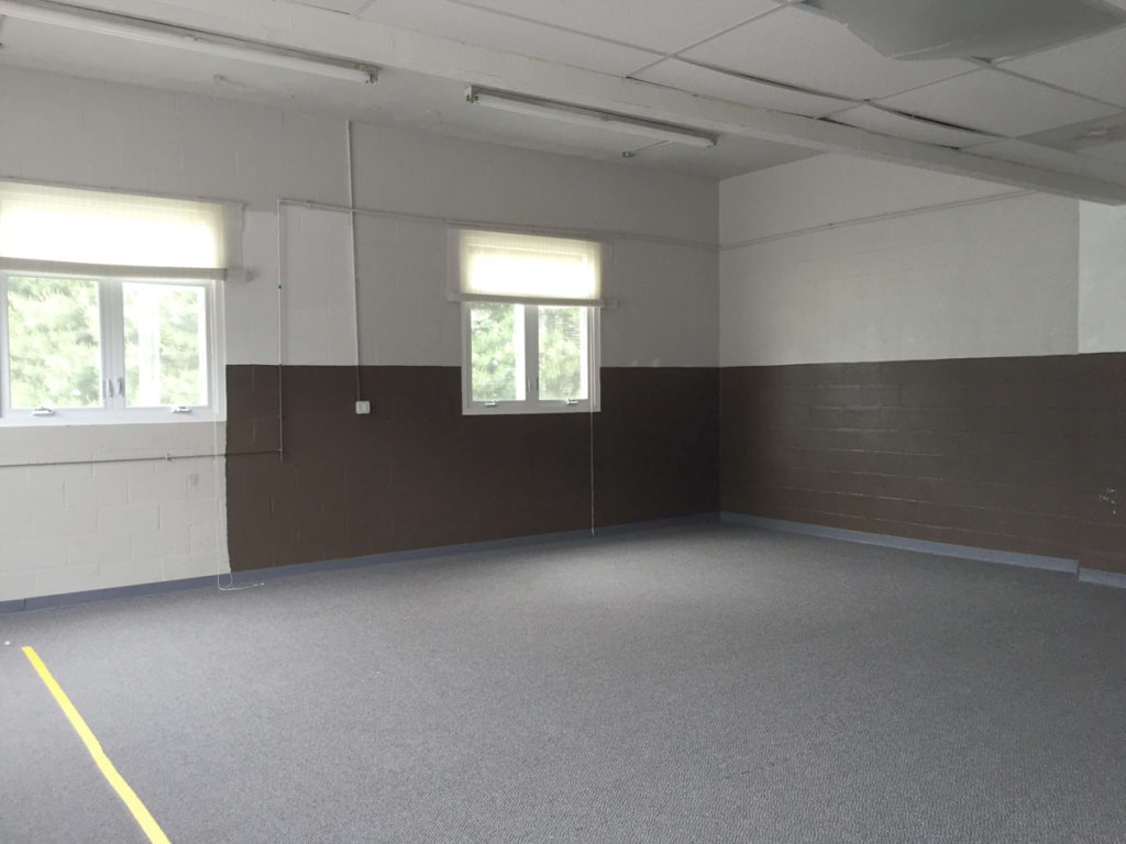
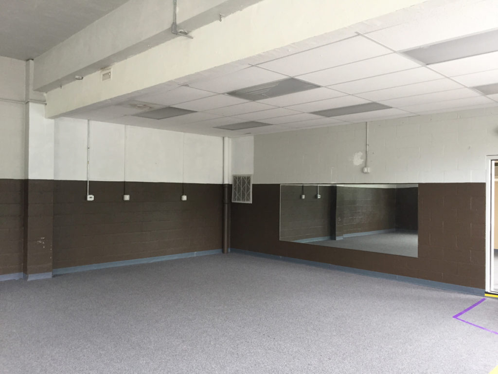
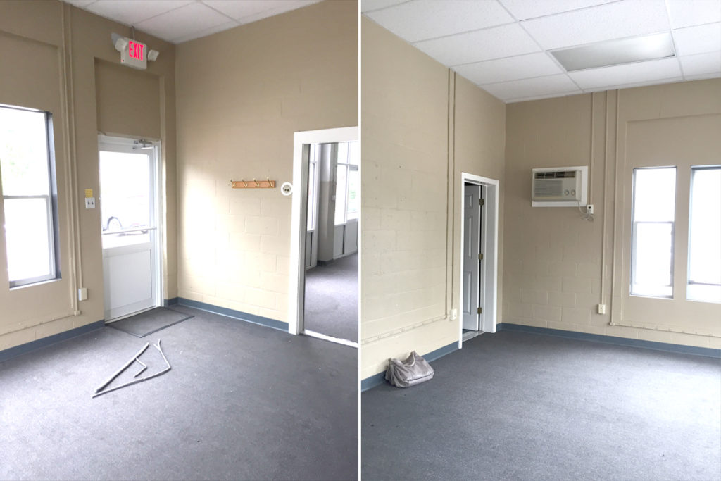
The space is really a blank slate. It was an auto garage once upon a time and in it's most recent life was a karate studio- neither of which really fit the aesthetic we'd want for a dance studio.

New DanceFIT Studio Interior before

New DanceFIT Studio Interior before

 New DanceFIT Studio Interior before

When I first sat down with Gina, the owner of DanceFIT to chat about the new space, I knew this would be fun- we were on the same page right from the start!  In the existing space, the brown walls and the dull carpet will be the first things to go- being replaced by white walls and durable wood look floors in the studio space.  That alone will be a huge breath of fresh air and the rest will be icing on the cake.

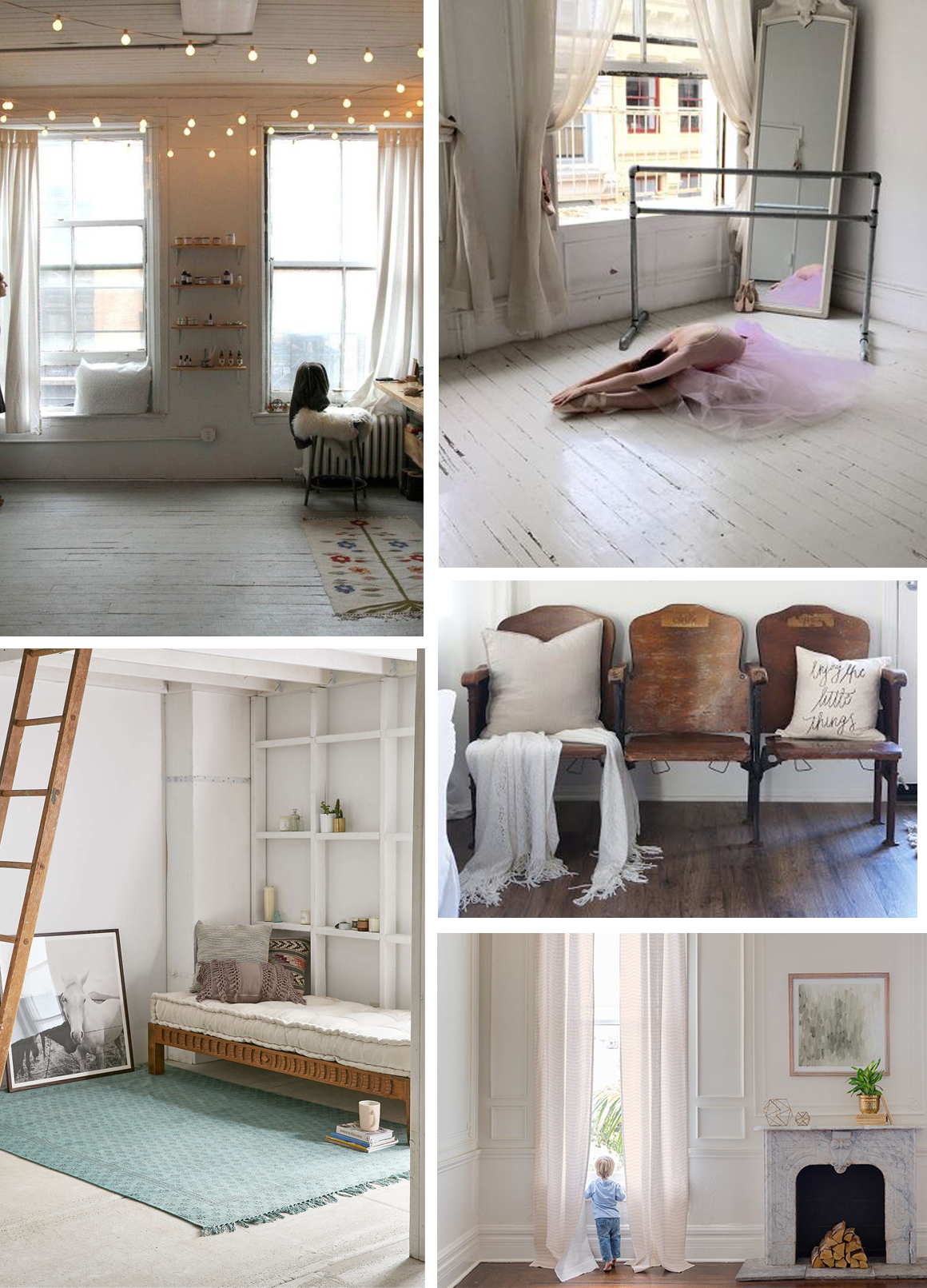
Aesthetically, our goal is a chic Soho loft feel- bright, a little vintage, and a little glam.  Here are some of our inspiration images:

New DanceFIT Studio design inspiration


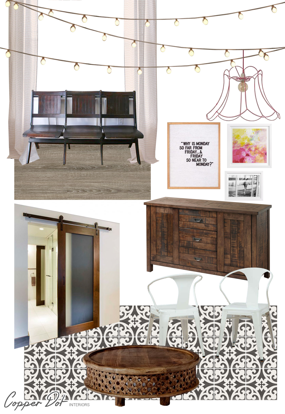
Since the space is rented, most of what we want to achieve will be through furniture and decor, but trust me, a HUGE difference will be made!  While the design is still evolving and I'm sure there will be changes prior to the final space, here is the current design plan:

dancefit-design


I'm loving this design and I can't wait to take it even further.  Gina is just days away from getting the keys in hand and that's when the real fun will start!  I'll keep you posted as the space progresses and I can't wait to show you the final result in just a few months!


Save

Save

Save

Save

Save

Save

Save

Neutral is not Boring

cd-tour-living-3.jpg

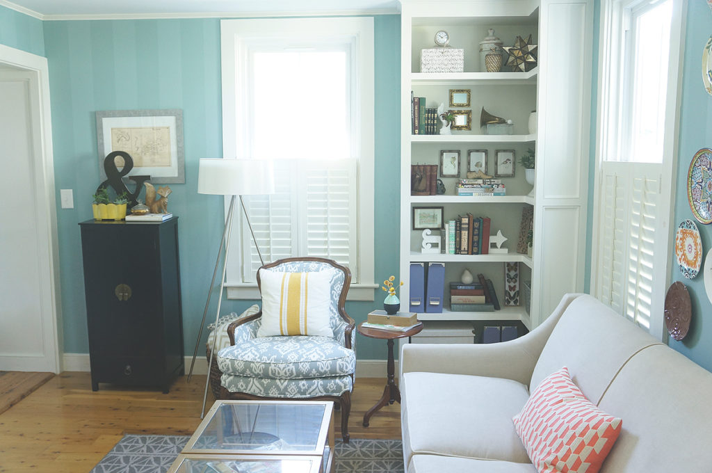
Did you notice the major change in my house in Wednesday's home tour?  My living room no longer has turquoise stripes!  Last time I had showed you the room, it looked like this: living-room-torquoise

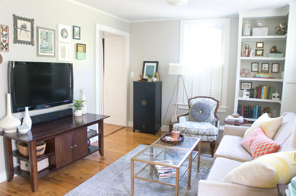
Now, most recently, my living room is a bit more neutral.

cd-tour-living-3

After 5 years of the turquoise stripes, the room was way overdue for a change.  I painted the stripes not all that long after we moved in- before I built the bookcase and before the room had scale-appropriate furniture.  Over time as elements got replaced and added, the room had started screaming over-designed to me and I needed to strip away a few elements so that it was a calming space once again.  Even though the room still isn't done, I think the change is a huge step in the right direction.  Hubby, however, isn't convinced.  He thinks I stripped the personality of the room out when I painted.  Au contraire Mr. Goodman, the things (and people) in the space can fill it with personality, not just the wall color.  So he challenged me to write a post with examples, convincing him that neutral rooms aren't boring.

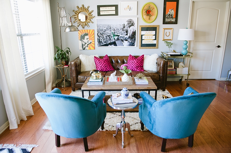
Personally, I think rooms with neutral walls can often be more filled with personality and color than other spaces that rely on the walls.  The collections, items, and the personality of each piece really gets a chance to shine!  While none of these rooms are exactly what I envision for our own living room, I think they are stellar examples of personality-packed neutral rooms.

Spray Paint + Chard_Kelly Rucker Photo-5

via Katie Taylor home tour on the Everygirl

I think these walls are technically a very light blue, but they act as a neutral in this room.  Every view of this room makes me swoon.  Check out the entire space at Domino Mag.

w1000_h1000


6a00d8358081ff69e201b8d11a5232970c-800wi

via Alayna Powell's home tour on A Beautiful Mess

While not a living room, there is a seating area...  Life is brought into this room with some pretty amazing textiles.

ambersmp_074$!x900

via Amber Interiors home tour on Style Me Pretty

8030242191_bd2d4f1acb_o

via Decor8

I dare you to call any of these spaces boring or lacking personality.  Well, Hubby, have I made a case at all or are you still skeptical?


Save

Save

Save